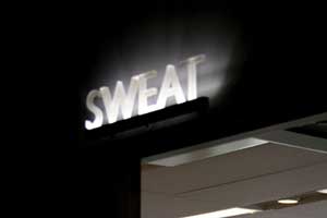
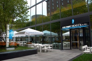
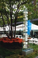
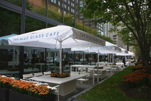
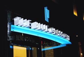
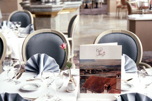
THE BLUE GLASS CAFE
BOSTON, MA
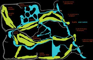
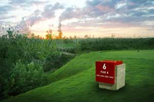
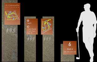
GOLF COURSE, MAYAN RIVIERA
MAYAN RIVIERA, MEXICO
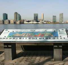
The wayfinding system for these 240 hectares of preserved lands includes pedestrian trails, beaches, lagoons, springs and other recreational resort amenities.
The design utilizes local stones and Corten Steel which incorporates
etched and paint-filled diagrams.
The design utilizes local stones and Corten Steel which incorporates
etched and paint-filled diagrams.
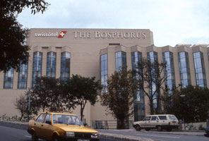
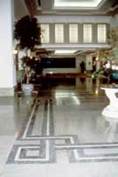
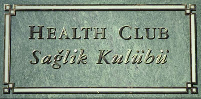
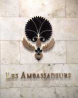
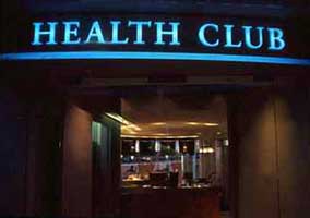
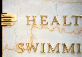
BOSPHORUS SWISSOTEL
ISTANBUL, TURKEY
This International Hotel’s graphic program was designed in English, Turkish and Japanese. It addresses a convention center and exhibition hall, banquet facilities, restaurants, bars, terraces and cafés,
a health club, retail stores and a multilevel parking garage.
The signage mirrors the hotel finishes with marble and brass. While logos and menus convey each restaurants flavor, the guestroom directory and amenities match the corporate branding.
The signage mirrors the hotel finishes with marble and brass. While logos and menus convey each restaurants flavor, the guestroom directory and amenities match the corporate branding.
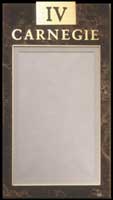
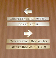
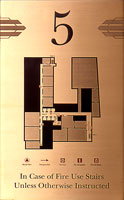
ITT Sheraton Hotel and Towers, New York & ITT Sheraton, Manhattan
NEW YORK, NY
The signage and graphic programs
for both hotels were developed simultaneously, establishing a unified brand image, yet respecting the architecture of each hotel.
While the Sheraton Hotel and Towers signage draws on the marble finishes of its interiors, the Sheraton Manhattan borrows the Art Deco details of its facade for attachments.
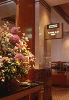
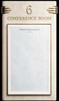
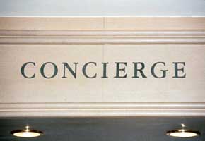
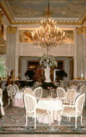
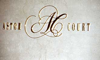
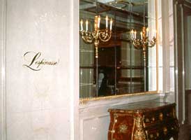
ST. REGIS SHERATON
NEW YORK, NY
Individual bronze letters and logos, applied directly to the old marble walls, minimize the intrusion of signage.
Visual Identities for the bar and restaurants were created as if designed for a past century, reinforcing the branding of this upscale New York landmark.
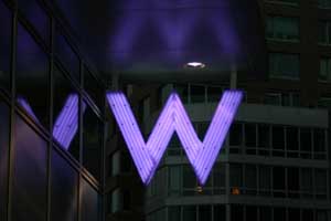
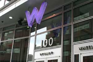
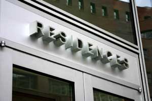
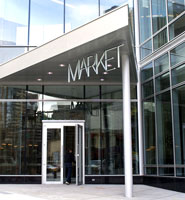
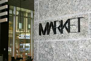
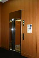
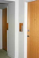
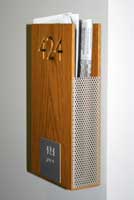
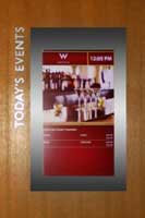
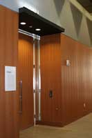
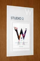
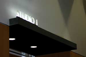
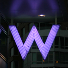
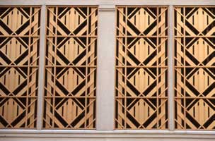
W HOTEL BOSTON
BOSTON, MA
Luminous purple W’s are strategically suspended from the marquis to maximize street level impact of the hotel’s brand.
The design exposes attachments and structure, adding visual interest to the letter profile.
Individual letters matching the building finishes identify the entrances and restaurant, while illuminated 3-D letters glow above the meeting rooms.
Departing from tradition, the guest room signs double as newspaper holders.
Individual letters matching the building finishes identify the entrances and restaurant, while illuminated 3-D letters glow above the meeting rooms.
Departing from tradition, the guest room signs double as newspaper holders.